User Guide - Color Grading Tools
Precise tools for stunning color
Welcome to the heart of Color.io - the color grading tools. This section of the user guide dives deep into how these tools can be used to dramatically enhance your photographic and cinematic work while removing many of the complexities associated with traditional color grading and look development.
Under the hood, Color.io is driven by a color engine that models the light response of analog film. The goal of the grading tools, is to make the complexities of this film-derived math accessible and intuitive. With the color grading interface controls, you can tap directly into the color engine in a visual way to modify presets, develop your own film emulations, and shape every aspect of your images for unparalleled richness in tone and color density.
This guide will support you in understanding and using these tools to their full potential.
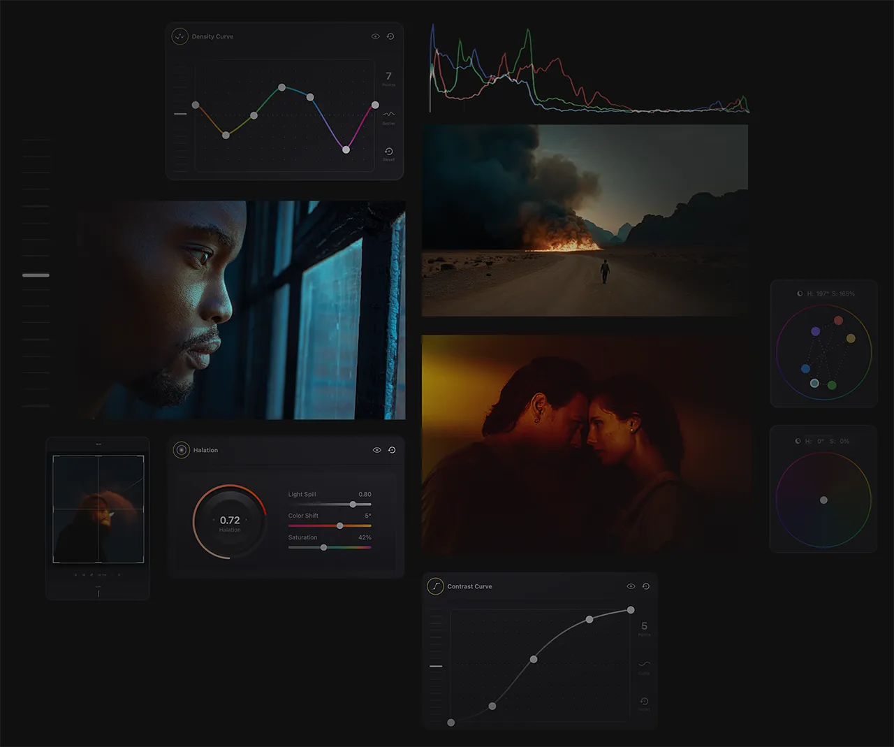
Color Grading Tools Overview
- Input & Output Color Spaces - Color.io allows for consistent, reliable, and accurate color representation via advanced cinema color management powered by ACES.
- The Spectrum Panel - the heart of the grade. Adjust brightness and saturation, color temperature and tint. Add ambient color to shadows with color wheels that mimic light behavior in the physical world or control individual hue vectors with an advanced light refraction model.
- Film Density - a sophisticated model for adjusting color intensity, unlike traditional saturation controls. Color.io provides specific curves to tweak density against hue, chroma, and luminance for tonal richness and depth unmatched by other tools.
- Luminance curves in Color.io let you modify the brightness and contrast in your images in a filmic way with great precision. Easily create film contrast curves or adjust the brightness of specific colors using the Luma vs Hue curve.
Remember, every tool in Color.io is designed to help you create natural, film-like color grades with the utmost precision and flexibility. The secret to mastering Color.io lies in understanding how each tool fits into this philosophy and your workflows.
With practice and experimentation, you'll soon find that these tools offer a level of control and sophistication that will help you get the best color out of your images. So, let's dive deeper and start exploring these tools!
With Color.io you can edit images and build 3D LUTs with a powerful online raw developer and analog film look designer for photographers and filmmakers. Craft stunning film color in record time that works for any camera, in any software and on any device, directly in your browser.